CSS3之border-radius圆角 DIV盒子圆角 图片圆角,CSS3样式实现盒子对象圆角、图片圆角效果。div css3 border-radius圆角样式教程篇。
一、CSS3之border-radius圆角
1、DIVCSS3圆角单词:
2、语法结构
设置DIV对象盒子四个角5像素圆角效果
1 | div{border-radius:5px 0;} |
|
设置DIV对象盒子左上角和右下角5px圆角,其它两个角为0不圆角
1 | div{border-radius:5px 5px 0 0;} |
|
设置DIV对象盒子左上角和右上角5px圆角,其它两个角为0不圆角
3、说明:
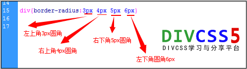
1 | border-radius:3px 4px 5px 6px |
|
代表设置对象左上角3px圆角、右上角4px圆角、右下角5px圆角、左下角6px圆角。
4、css圆角属性分析图
CSS3 border-radius圆角结构分析图
二、CSS3圆角案例
DIVCSS5分别对两个DIV盒子设置圆角、一个图片设置圆角实践CSS3圆角。
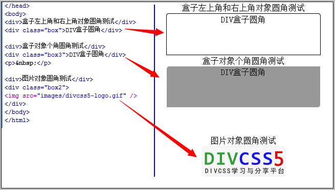
1、案例HTML代码
04 | <meta http-equiv="Content-Type" content="text/html; charset=utf-8" /> |
05 | <title>对象圆角 在线演示 DIVCSS5 VIP</title> |
06 | <link href="images/style.css" rel="stylesheet" type="text/css" /> |
09 | <div>盒子左上角和右上角对象圆角测试</div> |
10 | <div class="box">DIV盒子圆角</div> |
12 | <div class="box3">DIV盒子圆角</div> |
15 | <div class="box2"><img src="images/divcss5-logo.gif" /></div> |
|
2、案例CSS代码:
1 | .box {border-radius:5px 5px 0 0;border:1px solid #000;width:300px; height:80px; margin:0 auto} |
2 | .box2 img{border-radius:5px} |
3 | .box3{border-radius:5px 0; background:#999;width:300px; height:80px; margin:0 auto} |
|
3、圆角案例效果截图
4、案例说明
1)、第一个BOX盒子为了观察到圆角效果所以设置了边框样式,同时设置圆角样式border-radius:5px 5px 0 0;设置左上角和右上角圆角。
2)、第二个BOX3盒子设置背景色,同时设置圆角样式border-radius:5px 0,设置左上角和右下角圆角
3)、第三个对box2盒子里图片img设置圆角样式border-radius:5px,设置四个角均圆角。


发表评论
评论列表(0条)